Variable: AdwComboRow
constAdwComboRow:"AdwComboRow"
Defined in: generated/jsx.ts:14604
A Gtk.ListBoxRow used to choose from a list of items.
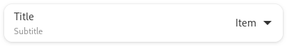
The AdwComboRow widget allows the user to choose from a list of valid
choices. The row displays the selected choice. When activated, the row
displays a popover which allows the user to make a new choice.
Example of an AdwComboRow UI definition:
<object class="AdwComboRow">
  <property name="title" translatable="yes">Combo Row</property>
  <property name="model">
    <object class="GtkStringList">
      <items>
        <item translatable="yes">Foo</item>
        <item translatable="yes">Bar</item>
        <item translatable="yes">Baz</item>
      </items>
    </object>
  </property>
</object>
The ComboRow.selected and ComboRow.selected-item properties can be used to keep track of the selected item and react to their changes.
AdwComboRow mirrors Gtk.DropDown, see that widget for details.
AdwComboRow is Gtk.ListBoxRow.activatable if a model is set.
CSS nodes
AdwComboRow has a main CSS node with name row and the .combo style
class.
Its popover has the node named popover with the .menu style class, it
contains a Gtk.ScrolledWindow, which in turn contains a
Gtk.ListView, both are accessible via their regular nodes.
Accessibility
AdwComboRow uses the GTK_ACCESSIBLE_ROLE_COMBO_BOX role.