Variable: AdwHeaderBar
constAdwHeaderBar:"AdwHeaderBar"
Defined in: generated/jsx.ts:16232
A title bar widget.
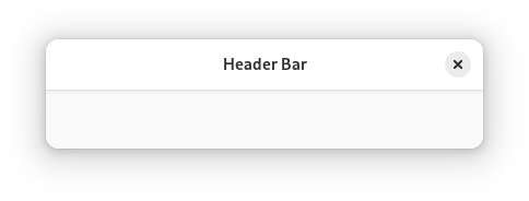
AdwHeaderBar is similar to Gtk.HeaderBar, but provides additional
features compared to it. Refer to GtkHeaderBar for details. It is typically
used as a top bar within ToolbarView.
Dialog Integration
When placed inside an Dialog, AdwHeaderBar will display the dialog
title instead of window title. It will also adjust the decoration layout to
ensure it always has a close button and nothing else. Set
HeaderBar.show-start-title-buttons and
HeaderBar.show-end-title-buttons to FALSE to remove it if it's
unwanted.
Navigation View Integration
When placed inside an NavigationPage, AdwHeaderBar will display the
page title instead of window title.
When used together with NavigationView or NavigationSplitView, it will also display a back button that can be used to go back to the previous page. The button also has a context menu, allowing to pop multiple pages at once, potentially across multiple navigation views.
Set HeaderBar.show-back-button to FALSE to disable this behavior
in rare scenarios where it's unwanted.
Split View Integration
When placed inside NavigationSplitView or OverlaySplitView,
AdwHeaderBar will automatically hide the title buttons other than at the
edges of the window.
Bottom Sheet Integration
When played inside BottomSheet, AdwHeaderBar will not show the title
unless BottomSheet.show-drag-handle is set to FALSE, regardless
of HeaderBar.show-title. This only applies to the default title,
titles set with HeaderBar.title-widget will still be shown.
Centering Policy
HeaderBar.centering-policy allows to enforce strict centering of the title widget. This can be useful for entries inside Clamp.
Title Buttons
Unlike GtkHeaderBar, AdwHeaderBar allows to toggle title button
visibility for each side individually, using the
HeaderBar.show-start-title-buttons and
HeaderBar.show-end-title-buttons properties.
CSS nodes
headerbar
╰── windowhandle
    ╰── box
        ├── widget
        │   ╰── box.start
        │       ├── windowcontrols.start
        │       ├── widget
        │       │   ╰── [button.back]
        │       ╰── [other children]
        ├── widget
        │   ╰── [Title Widget]
        ╰── widget
            ╰── box.end
                ├── [other children]
                ╰── windowcontrols.end
AdwHeaderBar's CSS node is called headerbar. It contains a windowhandle
subnode, which contains a box subnode, which contains three widget
subnodes at the start, center and end of the header bar. The start and end
subnodes contain a box subnode with the .start and .end style classes
respectively, and the center node contains a node that represents the title.
Each of the boxes contains a windowcontrols subnode, see
Gtk.WindowControls for details, as well as other children.
When HeaderBar.show-back-button is TRUE, the start box also
contains a node with the name widget that contains a node with the name
button and .back style class.
Accessibility
AdwHeaderBar uses the GTK_ACCESSIBLE_ROLE_GROUP role.