Variable: AdwNavigationSplitView
constAdwNavigationSplitView:"AdwNavigationSplitView"
Defined in: generated/jsx.ts:17706
A widget presenting sidebar and content side by side or as a navigation view.
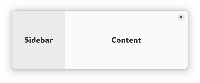
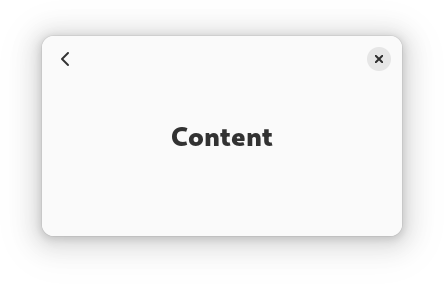
AdwNavigationSplitView has two NavigationPage children: sidebar and
content, and displays them side by side.
When NavigationSplitView.collapsed is set to TRUE, it instead
puts both children inside an NavigationView. The
NavigationSplitView.show-content controls which child is visible
while collapsed.
See also OverlaySplitView.
AdwNavigationSplitView is typically used together with an Breakpoint
setting the collapsed property to TRUE on small widths, as follows:
<object class="AdwWindow">
  <property name="width-request">280</property>
  <property name="height-request">200</property>
  <property name="default-width">800</property>
  <property name="default-height">800</property>
  <child>
    <object class="AdwBreakpoint">
      <condition>max-width: 400sp</condition>
      <setter object="split_view" property="collapsed">True</setter>
    </object>
  </child>
  <property name="content">
    <object class="AdwNavigationSplitView" id="split_view">
      <property name="sidebar">
        <object class="AdwNavigationPage">
          <property name="title" translatable="yes">Sidebar</property>
          <property name="child">
            <!-- ... -->
          </property>
        </object>
      </property>
      <property name="content">
        <object class="AdwNavigationPage">
          <property name="title" translatable="yes">Content</property>
          <property name="child">
            <!-- ... -->
          </property>
        </object>
      </property>
    </object>
  </property>
</object>
Sizing
When not collapsed, AdwNavigationSplitView changes the sidebar width
depending on its own width.
If possible, it tries to allocate a fraction of the total width, controlled with the NavigationSplitView.sidebar-width-fraction property.
The sidebar also has minimum and maximum sizes, controlled with the NavigationSplitView.min-sidebar-width and NavigationSplitView.max-sidebar-width properties.
The minimum and maximum sizes are using the length unit specified with the NavigationSplitView.sidebar-width-unit.
By default, sidebar is using 25% of the total width, with 180sp as the minimum size and 280sp as the maximum size.
Header Bar Integration
When used inside AdwNavigationSplitView, HeaderBar will
automatically hide the window buttons in the middle.
When collapsed, it also displays a back button for the content widget, as well as the page titles. See NavigationView documentation for details.
Actions
AdwNavigationSplitView defines the same actions as AdwNavigationView, but
they can be used even when the split view is not collapsed:
-
navigation.pushtakes a string parameter specifying the tag of the page to push. If it matches the tag of the content widget, it sets NavigationSplitView.show-content toTRUE. -
navigation.popdoesn't take any parameters and sets NavigationSplitView.show-content toFALSE.
AdwNavigationSplitView as GtkBuildable
The AdwNavigationSplitView implementation of the Gtk.Buildable
interface supports setting the sidebar widget by specifying “sidebar” as the
“type” attribute of a <child> element, Specifying “content” child type or
omitting it results in setting the content widget.
CSS nodes
AdwNavigationSplitView has a single CSS node with the name
navigation-split-view.
When collapsed, it contains a child node with the name navigation-view
containing both children.
navigation-split-view
╰── navigation-view
    ├── [sidebar child]
    ╰── [content child]
When not collapsed, it contains two nodes with the name widget, one with
the .sidebar-pane style class, the other one with .content-view style
class, containing the sidebar and content children respectively.
navigation-split-view
├── widget.sidebar-pane
│   ╰── [sidebar child]
╰── widget.content-pane
    ╰── [content child]
Accessibility
AdwNavigationSplitView uses the GTK_ACCESSIBLE_ROLE_GROUP role.