Variable: GtkDropDown
constGtkDropDown:"GtkDropDown"
Defined in: generated/jsx.ts:14953
Allows the user to choose an item from a list of options.
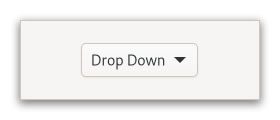
The GtkDropDown displays the [selected]Gtk.DropDown.selected
choice.
The options are given to GtkDropDown in the form of GListModel
and how the individual options are represented is determined by
a Gtk.ListItemFactory. The default factory displays simple strings,
and adds a checkmark to the selected item in the popup.
To set your own factory, use Gtk.DropDown.set_factory. It is possible to use a separate factory for the items in the popup, with Gtk.DropDown.set_list_factory.
GtkDropDown knows how to obtain strings from the items in a
Gtk.StringList; for other models, you have to provide an expression
to find the strings via Gtk.DropDown.set_expression.
GtkDropDown can optionally allow search in the popup, which is
useful if the list of options is long. To enable the search entry,
use Gtk.DropDown.set_enable_search.
Here is a UI definition example for GtkDropDown with a simple model:
<object class="GtkDropDown">
  <property name="model">
    <object class="GtkStringList">
      <items>
        <item translatable="yes">Factory</item>
        <item translatable="yes">Home</item>
        <item translatable="yes">Subway</item>
      </items>
    </object>
  </property>
</object>
If a GtkDropDown is created in this manner, or with
Gtk.DropDown.new_from_strings, for instance, the object returned from
Gtk.DropDown.get_selected_item will be a Gtk.StringObject.
To learn more about the list widget framework, see the overview.
CSS nodes
GtkDropDown has a single CSS node with name dropdown,
with the button and popover nodes as children.
Accessibility
GtkDropDown uses the Gtk.AccessibleRole.combo_box role.