Variable: GtkComboBox
constGtkComboBox:"GtkComboBox"
Defined in: generated/jsx.ts:14499
A GtkComboBox is a widget that allows the user to choose from a list of
valid choices.
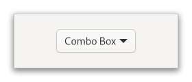
The GtkComboBox displays the selected choice; when activated, the
GtkComboBox displays a popup which allows the user to make a new choice.
The GtkComboBox uses the model-view pattern; the list of valid choices
is specified in the form of a tree model, and the display of the choices
can be adapted to the data in the model by using cell renderers, as you
would in a tree view. This is possible since GtkComboBox implements the
Gtk.CellLayout interface. The tree model holding the valid
choices is not restricted to a flat list, it can be a real tree, and the
popup will reflect the tree structure.
To allow the user to enter values not in the model, the
Gtk.ComboBox.has-entry property allows the GtkComboBox to
contain a Gtk.Entry. This entry can be accessed by calling
Gtk.ComboBox.get_child on the combo box.
For a simple list of textual choices, the model-view API of GtkComboBox
can be a bit overwhelming. In this case, Gtk.ComboBoxText offers
a simple alternative. Both GtkComboBox and GtkComboBoxText can contain
an entry.
CSS nodes
combobox
├── box.linked
│   ╰── button.combo
│       ╰── box
│           ├── cellview
│           ╰── arrow
╰── window.popup
A normal combobox contains a box with the .linked class, a button with the .combo class and inside those buttons, there are a cellview and an arrow.
combobox
├── box.linked
│   ├── entry.combo
│   ╰── button.combo
│       ╰── box
│           ╰── arrow
╰── window.popup
A GtkComboBox with an entry has a single CSS node with name combobox.
It contains a box with the .linked class. That box contains an entry and
a button, both with the .combo class added. The button also contains another
node with name arrow.
Accessibility
GtkComboBox uses the Gtk.AccessibleRole.combo_box role.